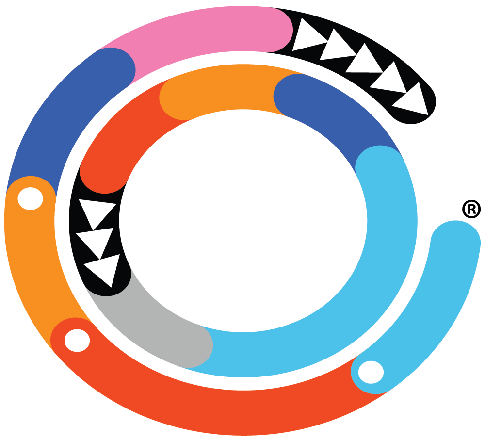
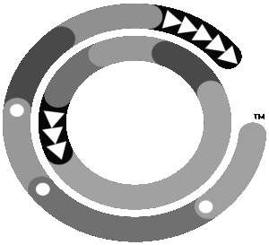
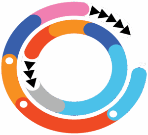
The Ho’Omau Endurance™ logo and color selection has quite a few meanings behind it. Yes, it’s just a corporate brand, but to us, it has purpose, just like our Hawaiian name Ho’Omau. So, what are these circles and colors all about?
The open outer circle represents our favorite endurance sports:
- Light Blue: Swimming. Representing a crystal clear ocean swim in Kona, Nice or wherever else your mind can imagine.
- Fast Hot Red: Cycling. Representing a fast bike and hot conditions in the lava fields of Kona. Red also represents a longer part of the circle to symbolize that cycling generally takes up the most time, in triathlon and as a single sport.
- Sunset Orange: Running. Representing the orange skies as the sun sets during the early evening run.
- White Dots: The white dots at the end of the blue (swimming), red (cycling) and orange (running) sections represent that while each sport is individual in nature, they can also be chained together to represent a triathlon.
- Dark Blue: Recovery. Representing the dark night sky at the end of a long race, giving the body much needed rest, recovery and a calm mind.
- Pink: Representing all other less-frequented, but not less relevant, endurance sports, such as rowing, cross country skiing, etc.
- Black Aztec Triangles: A common native Hawaiian symbol with several meanings, including strength, but also representing Ho’Omau forward movement of the outer circle as we propel our sport(s) forward, and our sport(s) propel us forward.
- The Empty Gap: Offseason, Injury, Illness & Life. Representing the fact that as much as we love our sport(s), there will be breaks. Some of them purposeful, some of them unwanted and underserved.
The closed inner circle represents the human performing our favorite endurance sports and the 5 primary zones:
- Light Gray: Rest, Active Recovery, Zone 1. Representing the easiest kind of efforts we encounter as endurance athletes.
- Light Blue: Active, Comfortable, Zone 2. Representing the longest color in the inner circle as the primary yet ‘light’ training zone for most of us endurance athletes.
- Dark Blue: Working, Racing, Zone 3. Representing tempo or race pace. Still very manageable, not yet orange, but getting closer to your threshold line.
- Orange: Hard Effort, Zone 4: Representing above threshold and Vo2 Max efforts that can only be sustained for so long.
- Red: Max Effort, All Out, Zone 5: Representing the end of the road for most of us before we break down and are forced to stop.
- Closed Circle with Black Aztec Triangles: The closed inner circle represents the continuity of the human body and our training zones. There is no gap, no empty space. As long as you live, the circle continues to move forward with the strength and in the direction represented by the Aztec triangles, and your body will always be present in one of the 5 main zones and colors.
